Monday, February 25, 2013

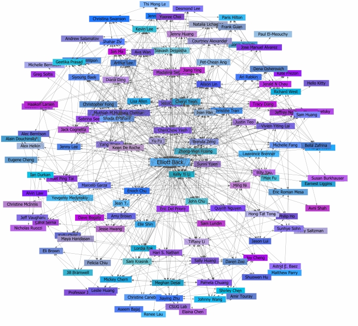
Statistical Map


Statistical Map- These can represent distances relative to another property besides physical distance, and can thus be used to demonstrate relationships among entities. This is a statistical map of connectivity between people on the social media site Facebook. Individuals that appear to be close to others aren't necessarily close in a physical sense, or in any other way besides online (http://markvandykenewsroom.blogspot.com/2011/04/social-media-is-extremely-important.html).

Cartogram


Cartogram- Usually incorporates a thematic mapping variable, while the geometry or area of the map is distorted in order to spatially convey this or another variable as well. In this cartogram of the 2004 election for President, each state is assigned a color based on who the majority of the state's registered voters voted for, either Gore or Bush. In addition, each state is also spatially distorted in order to convey relative population size (http://panse.org/CartoDraw/).

Flow Map


Flow Map- These maps show the path of entities across a surface and the intensity of travel along
these paths. Here, networks of truck flows and amounts from Texas across the US are shown. This can also be classified as a chloropleth map, since state to state transportation flows are divided into intervals and states are color coded accordingly (http://www.lib.utexas.edu/maps/texas.html).

Isoline Map


Isoline Map- A hypsometric map that uses continuous lines (contour lines) to connect points of the same value for a variable, such as elevation, air pressure, wind direction, etc. This map show historical travel times from different US continental locations to New York city (http://mapmaker.rutgers.edu/355/Journey_to_Work.jpg).

Friday, February 15, 2013

Proportional Circle Map


Proportional Circle Map- Circle symbols on the map vary in size according to the numerical value they represent. The number of internet users throughout Europe in 2004 are shown here (the smallest unit represented is 200,000 people, the largest is greater than 8,500,000) (http://www.geog.ucsb.edu/~jeff/gis/proportional_symbols.html).

Choropleth Map


Choropleth Map- A type of thematic map that portrays areal data, where areas are shaded or patterned in proportion to the measurement of the statistical variable being represented. This is a classed choropleth map, where the varying percentages of people with a full education in Nova Scotia, Canada (2001) are represented by colors corresponding to natural break intervals (selected by the discretion of the map maker and information provided by a corresponding histogram). Numerical values for an areal unit may be areally averaged, expressed as percentages here.  (http://www.cs.umd.edu/class/spring2005/cmsc838s/viz4all/viz4all_a.html).

Dot Distribution Map


Dot Distribution Map- Uses a dot or other symbol (doesn't vary in size) to represent the presence, density, and spatial pattern of one or more features or phenomenons. In this case the population of the United States according to the 2000 census is shown, one dot representing 7500 people (https://www.census.gov/geo/www/mapGallery/2kpopden.html).